 Route Analyst GTFS has been released for the following three agencies in the Greater Seattle area; King County Metro (KCM), Pierce County and the Washington State Ferries. KCM provides public transit throughout the greater Seattle region servicing towns from Lake Forest Park and Bothell in the North to Kirkland, Redmond and Bellevue in the East and Burien, Tukwila, Renton, Federal Way and Auburn in the South. Pierce Transit covers the greater Tacoma area and the WA State Ferries link many of the islands in the Puget Sound and in the San Juan Islands.
These agencies make their schedule available as a GTFS files and also publish the movement of all their buses, trains and ferries in real-time as a GTFS Real Time Vehicle Position file. Route Analyst GTFS tracks all vehicle movement live and retains all movement data.
 Ferry Movement in Puget Sound Nov 27-29
The above image shows the speed for the ferries in the southern Puget Sound. The Puget Sound is tidal and you can see that the vessels go South or North first depending on the tide. This results in the ‘S-curve’ movement patterns that you see.
With Route Analyst users can see all vehicle movement in real time. Route Analyst GTFS has a movement playback mode. You can select a time of day, a play back speed and then click play.
Ferry Movement in the San Juan Islands on Nov 28 2017
In the above video the vessels are moved five minutes in time every second. The top graph shows the average speed of all vessels whereas the bottom graph shows the average delay of all ferries. As you can see the delays are the largest during the middle of the day.
The agencies update the vehicle location files every 20-40 seconds. When Route Analyst is set to Live Mode users will see the last reported location for every bus, train or ferry. To see information on a particular vehicle just zoom in and click on the object.
Route Analyst GTFS generates a very rich set of variables that give transit planners and engineers a wealth of information. Route Analyst GTFS tracks the speed, delay, headway, travel times as well as the route progress. The software also tracks the day and time and it has easy selectors to allow analysts to quickly compare route performance on, for example, evening peak hours over a month of time.
![Image 3. King County Route 102619 Westbound Weekday Travel Time and Speed]](https://i0.wp.com/www.db4iot.com/wp-content/uploads/2021/07/King-County-Metro-Route-102619-Westbound-Weekdays-Travel-Time-Graph-and-Speed-Map-1024x576.jpeg?resize=790%2C444) King County Route 102619 Westbound Weekday Travel Time and Speed
King County Route 102619 Westbound Weekday Travel Time and Speed
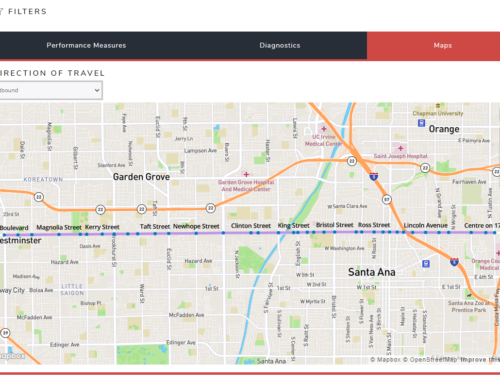
The map is colored by the speed of the buses. On the map you can see exactly where the buses need to slow down and where they can speed up. The graph in the above image shows the travel time along route 102619 during weekdays. The dotted line shows the standard deviation from the mean. The farther the dotted line is from the mean, the more variation there is in the travel time and, therefor, the less reliable the service is. Travel time charts can be generated in seconds for any route in any direction for any type of day and time of day.
With Route Analyst GTFS transit planners can instantly generate heat charts to get a deep understanding of their route performance.
 KCM Route 102615 Northbound Weekday Delay by Time and Distance
In the image above the X-axis shows the distance traveled along Route 102615 in meters. The Y-axis shows the time of day. The data is colored by the calculated delay where green is early, yellow is no delay and red shows delays of 10 minutes or more (600 seconds). The chart instantly shows that the greatest delays are incurred during the evening peak from 5pm to 6:15pm starting at one mile (1500 meters) in. This is visible as a horizontal red band. There are also delays in the morning peak but this is spread over a longer period and the delays are less severe.
Delay heat charts can be generated for any route path (shape) in any direction within seconds. You can change the heat chart to look at speeds or headway deviation by simply selecting the variable in the right top ‘Color By’ dropdown. In the heat chart below we are looking at Pierce Transit Route 1.
 Pierce Transit Route 1 Northbound Speed Map and Heat Chart
In this image the Y-axis shows the distance traveled along the route whereas the time of day is shown on the X-axis. The Heat Chart is colored using the reported speed of all the vehicles. The map shows where the speeds are the lowest whereas the chart compares the distance along the route to the time of day.
Route Analyst GTFS includes a feature where analysts can open two or more views on the movement data. This allows analysts to instantly compare different routes, different route shapes, different directions or different time periods or the same route.
 KCM Route 102619 Evening Peak Speed Comparison Eastbound & Westbound
The above image shows a speed comparison for the evening peak for King County Route 102619. The top half of the image shows the Eastbound speed and the lower half shows the Westbound speed.
With Route Analyst you can zoom in on any area and switch the background image. In the image below we have zoomed in on Longacres Way and switched to a satellite image background. The image shows the differences in speed and trajectory between the Eastbound and Westbound directions of Route 102619 when stopping at the Longacres Way station.
With Route Analyst GTFS transit planners can instantly compare the performance of all routes and directions over any time period and look at this in tables.
 King County Routes sorted by Average Delay on Weekdays
The above chart shows all KCM routes in each direction on weekdays for the period from November 13-27. The data is sorted by delay and it shows that route 100288 in Direction 1 had the worst delays with an average of 300 seconds. The image below looks at the same data sorted by a different variable.
 King County Routes sorted by Standard Deviation of Headway Deviation
The data is now sorted by the standard deviation of Headway Deviation. This is an indicator of reliability. Route Analyst tracks headway for every route in every direction and compares this to the scheduled headway for that moment in time. The resulting value is stored as the Headway Deviation. The larger the standard deviation from the mean for the headway deviation, the more unpredictable the service was on this line.
Route Analyst GTFS runs in the cloud and requires no investment in servers or technical staff. Pricing for Route Analyst starts at only $199 per month.
Please let us know if you need access to Route Analyst GTFS for a transit agency that Moonshadow has not yet released. A video showing the power of Route Analyst GTFS is available here.
https://db4iot.com/route-analyst-gtfs
 Route Analyst GTFS was developed in close cooperation with DKS Associates, a leading transportation consulting firm in Portland, Oregon, and data engineers from TriMet, the public transit agency serving the Portland, Oregon metro area.
Route Analyst GTFS – Special Introductory Pricing: $199/month or $1,995/year


